CEO - Richard Thompson
October 25, 2024
News
Somnia Blockchain by Improbable: Reaching 400,000 TPS in DevNet Launch
CEO - Richard Thompson
October 19, 2024
News
BOC’s Blockchain Platform Transforms Marine Conservation Funding
CEO - Richard Thompson
October 11, 2024
News
Justin Sun Elected Prime Minister of Liberland Micronation 2024
CEO - Richard Thompson
October 9, 2024
News
Hex Trust & Clearpool Launch Ozean Blockchain for RWA Yield
CEO - Richard Thompson
October 7, 2024
News
Blockchain Supply Chain Market Can Hit $18.7 Billion by 2030
CEO - Richard Thompson
October 6, 2024
News
Massimo Morini: Blockchain’s Role in Banking’s Future
CEO - Richard Thompson
October 6, 2024
News
Rexas Finance: The Next Big Rival to Solana (SOL)
CEO - Richard Thompson
October 4, 2024
News
Axelar’s Mobius Stack: Transforming Blockchain Interoperability with Cross-Chain Innovation
CEO - Richard Thompson
October 4, 2024
News
RD Technologies Raises $7.8M to Bridge Web2 and Web3 FinTech
CEO - Richard Thompson
October 3, 2024
News
The Reason Why Web3 & AI Investors Continue Their Influence in Dubai: MEAVSUMMIT 2025
CEO - Richard Thompson
September 29, 2024
Digital Marketing
The Real Guide To Internet Marketing: Learn Something New
Wordsmith - Emma
September 27, 2024
Content Writing
The Skills Required for Mastering Content Writing
Wordsmith - Emma
September 16, 2024
Content Writing
Copywriting vs. Content Writing: What’s the Difference?
SEO Expert - Sophie
September 13, 2024
Search Engine Optimization
What is PPC Management? Working,Types of PPC Agencies and Cost
John - Website Manager
June 19, 2024
Digital Marketing
The Future of Neuro-Marketing in Digital Marketing
John - Website Manager
June 18, 2024
Digital Marketing
Successful Examples of Neuro-Marketing Strategies
John - Website Manager
June 17, 2024
News
Canva Create 2024: Revolutionizing Design with AI-Powered Features
John - Website Manager
June 14, 2024
Digital Marketing
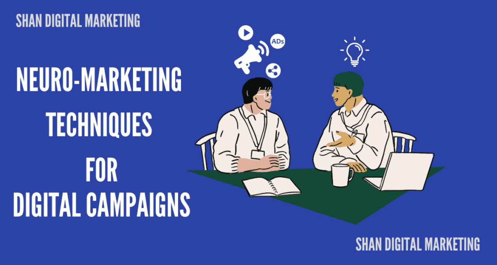
Neuro-marketing Techniques for Digital Campaigns
John - Website Manager
June 13, 2024
Digital Marketing
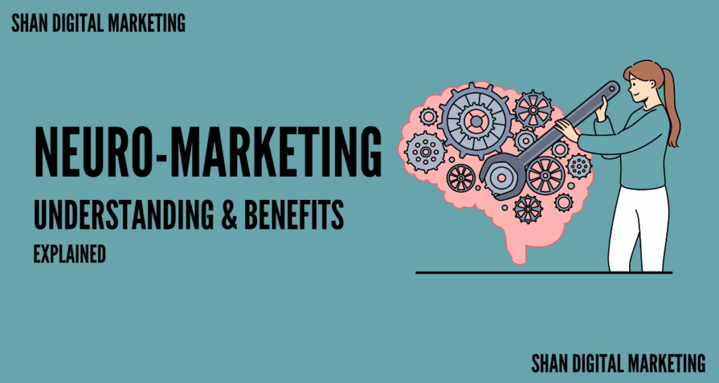
Understanding Neuro-Marketing and Its Benefits
CEO - Richard Thompson
June 12, 2024
News
Apple’s Intelligence Taking Over competitors?: Overview To It’s Features