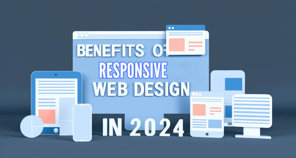
Introduction
In 2024, the digital landscape continues to evolve rapidly. With more devices connected to the internet than ever, ensuring your website looks great and works well on any device is essential. That’s where responsive web design comes in. It’s a vital part of web development that makes sure your website adapts to the screen it’s viewed on, whether it’s a smartphone, tablet, laptop, or desktop.
Responsive web design is all about providing a seamless experience to users, no matter how they access your site. Let’s dive into why it’s so crucial in today’s digital landscape.
The Evolution of Responsive Web Design
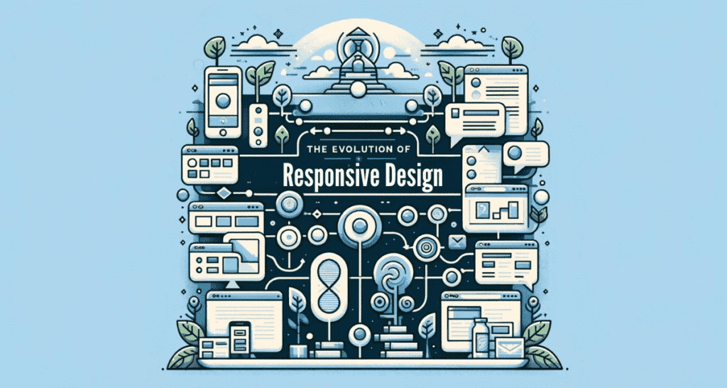
A Quick Look Back
Remember the days when websites were a jumbled mess on mobile devices? Zooming in and out just to read content or click a link was the norm. Responsive web design changed all that. It’s a design approach that responds to the user’s behavior and environment based on screen size, platform, and orientation.
Responsive web design emerged as the hero we needed. It’s like a smart outfit that adjusts whether you lose or gain a few pounds, ensuring you always look your best. In web terms, it means your site automatically adjusts to look great on any screen, ensuring users have a great experience no matter the device.
The Role of Mobile Devices
With mobile internet usage surpassing desktop in recent years, designing for mobile isn’t just an option; it’s a necessity. Responsive design means creating one website that automatically fits the size of the user’s device, ensuring a quality experience for everyone.
We have written a detailed article on The Ultimate Mobile SEO Checklist: Your Guide to Optimizing for Mobile Users.
Lower Bounce Rates and Higher Engagement
A website that’s easy to use on any device is like a welcoming local pub. People want to stay, look around, and come back often. This behavior signals search engines that your site is valuable, helping to improve your rankings. Higher engagement and lower bounce rates are direct benefits of responsive design, showing that your site meets users’ needs.
Enhanced User Experience (UX)
Seamless Cross-Device Compatibility
One of the biggest benefits of responsive design is its ability to provide a consistent experience across all devices. Users expect a smooth experience, whether they’re browsing on a phone during their commute or on a desktop at work.
Improved Usability
Responsive sites offer improved usability. Text is readable without zooming, navigation is simplified, and content is easily accessible. This user-friendly approach is key to keeping people on your site longer.
Improved Search Engine Optimization (SEO)

Mobile-First Indexing by Search Engines
Google loves mobile-friendly websites. In fact, its mobile-first indexing means Google predominantly uses the mobile version of the content for indexing and ranking. A responsive website is better positioned in search results, helping you stay visible to your audience.
Lower Bounce Rates and Higher Engagement
Websites that are easy to navigate and read on any device tend to have lower bounce rates. Users stick around, explore more, and engage with your content, which Google sees as a positive signal.
We have written a complete article to knowledge you about How Web Design Influences SEO in 2024.
Streamlined Development Process
Imagine building a house. Now, imagine building it in such a way that it can transform to suit the weather, the number of guests you have over, and even changes in your family size, all without needing to rebuild it from scratch each time. That’s the magic of responsive web design in the web development world.
Before responsive design became the standard, businesses often had to build several versions of their websites to accommodate different devices. This was like managing multiple houses at once — expensive and exhausting. Responsive design streamlines the development process by using fluid grids, flexible images, and media queries to create a single, adaptable website. It’s a smarter approach, allowing you to invest your resources wisely and focus on perfecting a single site that delivers across all platforms.
Easier Maintenance
Maintaining one responsive website is significantly less work than updating multiple versions of a site for different devices. It’s the difference between having one houseplant to water versus a whole garden. With a single responsive site, updates need to be made just once, and the changes will take effect across all devices, ensuring consistency and reducing the likelihood of errors.
Moreover, responsive design grows with your business. As new devices and screen sizes hit the market, a well-designed responsive site will adapt, making it future-proof. This adaptability reduces the need for frequent overhauls or redesigns, saving you time and money in the long run.
Increased Conversion Rates
Enhanced User Trust and Satisfaction
Trust and satisfaction are the foundations of any successful relationship, and this holds true for the relationship between your website and its visitors. A responsive website speaks volumes about your brand’s professionalism and commitment to user experience. It tells your visitors that you value their time and comfort, regardless of how they choose to interact with your site.
This level of consideration builds trust, and a trusted site is one that users feel comfortable engaging with, whether that’s making a purchase, signing up for a newsletter, or sharing personal information. In essence, responsive design can directly influence your visitors’ decision-making process, nudging them toward taking the actions you want them to take.
Simplified Call-to-Action (CTA) and Navigation
Responsive design ensures that your calls-to-action (CTAs) and navigation are clear and accessible on any device. Think of it as clear signage on a highway; no matter the vehicle you’re driving, you can see where you need to go and how to get there.
By optimizing CTAs for mobile users — with buttons that are easy to tap and text that’s easy to read — you significantly increase the chances of converting visitors into leads or customers. Similarly, simplifying navigation makes it easier for users to explore your site, find what they’re looking for, and take desired actions without frustration
Competitive Advantage
Staying Ahead in the Digital Race
In the fast-paced world of the internet, staying ahead of the competition is crucial. Responsive web design is like having the fastest, most adaptable car in the race, allowing you to navigate the digital landscape with agility and precision. In 2024, where the majority of users access the web through various devices, having a website that looks good and functions well on any screen is a significant edge over competitors who haven’t embraced this approach. It’s not just about keeping pace; it’s about setting the pace, showing that your brand is forward-thinking and user-centric.
Meeting User Expectations
Today’s internet users expect a lot. They want fast, seamless, and enjoyable experiences, no matter how they’re accessing your website. A responsive website meets these expectations head-on, providing a frictionless experience that can significantly improve user satisfaction and loyalty. It’s like walking into your favorite store and finding everything exactly where you expect it to be, every time. This level of predictability and ease can turn casual visitors into loyal customers, giving you a distinct advantage in attracting and retaining a dedicated audience.
The Future of Responsive Web Design
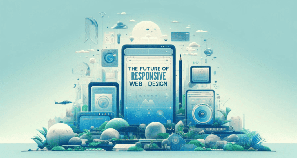
Upcoming Trends and Technologies
As we look to the future, responsive web design continues to evolve, driven by new technologies and user behaviors. Emerging trends like voice search optimization, augmented reality (AR) shopping experiences, and AI-driven personalization are set to redefine what responsive design encompasses. Staying attuned to these trends ensures that your website not only responds to screen size but also to the changing ways users interact with online content. It’s about anticipating the road ahead and adapting your strategy to meet tomorrow’s needs today.
We have also written about Why Web Designing is Important in 2024.
Preparing for the Unknown
One of the most compelling aspects of responsive design is its adaptability to future devices and browsing methods that haven’t even been imagined yet. Designing with responsiveness in mind means you’re preparing for the unknown, ensuring that whatever next big thing comes along, your website can adapt and remain accessible and engaging. It’s akin to building a house with the ability to transform itself to meet any climate condition—whatever the future holds, you’re ready for it.
Conclusion
Responsive web design is more than a technical necessity; it’s a strategic asset in 2024. It enhances user experience, improves SEO, saves time and money, boosts conversion rates, and provides a competitive advantage. As digital technology continues to evolve, the principles of responsive design ensure that your website can meet the demands of today and adapt to the possibilities of tomorrow.
In a world where online presence is integral to success, responsive web design is not just about surviving; it’s about thriving. It ensures that your site is accessible, engaging, and effective for every user, on every device, at every moment. That’s not just good design; it’s good business.

- Leveraging Analytics for Web Design Optimization - April 30, 2024
- The Role of Artificial Intelligence in Web Design - April 29, 2024
- How to Create an Inclusive Web Design - April 26, 2024